New Sidebar Feature in DeployBot
How many clicks do you need to get to your profile or notification settings, the integrations with external apps, and your containers? How long does it take you to display all connected repositories, their environments, and the related servers & settings?
To be honest, I never counted my clicks, I just saved some bookmarks for the pages I needed frequently. With the new sidebar that's no longer necessary, and – let's face it – DeployBot looks so much better now.

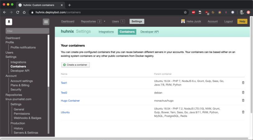
It's not just about the design, though, it also improves DeployBot's usability. After you've logged in, just click on the hamburger button (icon with three horizontal bars) in the top left corner to toggle the sidebar. On the left side you see a tree-like structure; the current page gets highlighted. You can reach the following settings (from top to bottom):
- DeployBot dashboard
- Your Profile (including notification settings)
- Account settings (including plans & billing and the security settings)
- Repositories (overview of all connected repositories)
DeployBot is here to help you: it comes with a number of integrations for external tools and can quickly deploy your work to different environments. You can find an ever growing collection of beginners’ guides on our website:
Laravel, Digital Ocean, Ruby on Rails, Docker, Craft CMS, Ghost CMS, Google Web Starter Kit, Grunt or Gulp, Slack, Python, Heroku, and many more.
For every repository you can also easily reach the settings, for example the permissions, the webhooks & badges, the environments with the server configuration and additional configuration files.
TIP: Click on the pin icon to keep the sidebar open during navigation. If you're searching for a particular setting or repository, use the filter box at the top of the sidebar.
So, I'm pretty happy with the newest addition to DeployBot – the user-friendly layout saves a lot of time and navigating has become a lot easier. Let us know what you think and leave a comment!


