Introducing a new dashboard
Today we’re introducing a new dashboard that provides more information and is easier to use than ever before. The old one was getting the job done (most of the time), but was inelegant, missed data critical for understanding recent events, and was pretty hard to scan and digest. After talking to our customers and seeing how we use it ourselves we decided to start from a blank slate and redesign it instead of applying UI band-aids.

Let me walk you through it and explain some of the changes we made.
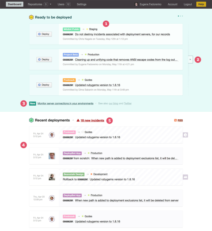
- Environments ready to be deployed. We check all your connected repositories for changes and if there is anything available to deploy you’ll see that environment in this list. It’s much easier to see repository and target environment now, and there is more information provided about the latest commit available to be deployed.
- Updated environments can be scrolled if you or your team were really productive and have a lot of changes to be deployed. The indicator in the top right corner shows how many groups you have waiting.
- We used to show links to some of our blog announcements in a sidebar, but now every one (hey, even this one!) is shown on your dashboard automatically.
- Recent deployments changed the most in this redesign. Your target environment is shown in addition to its source repository, and it’s clear if a deployment was triggered manually or automatically (compare the first 2 deployments) and by whom.
- Incident indicators got a new home, but hopefully you won’t see these too often.
We hope you’ll enjoy using the new dashboard as much as we do. If you have any ideas or suggestions please don't hesitate to let us know!


