Improved layout and 100% Retina support
If you have a sharp eye you may have noticed that some things changed in DeployBot this week. We cleaned up and refreshed the design a little bit, so now it’s sparkling and ready for some new amazing features. Below I will go through what we changed.
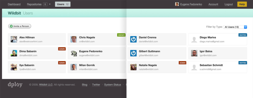
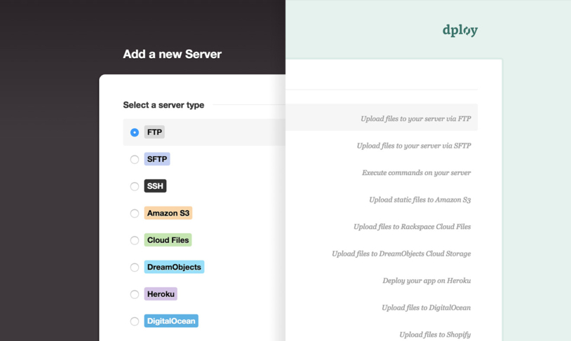
More whitespace and light: the dark border around regular pages is gone and now they take all available space in the browser window. The footer hiding below the fold is a favorite of mine — it’s still there when you occasionally need one of the links, but out of your way most of the time. Wizards are bigger, lighter, and also use space more efficiently.


Retina all the way: Apple introduced the MacBook Pro with Retina over 2.5 years ago and since then the number of customers with Retina screens has been growing constantly. It's over 10% now! We had most of the images updated a while ago, but there were still some leftovers here and there. Well, now they are all gone — every design element in the app should look crystal clear and sharp. This was also a good time to replace some of the images with pure CSS, so now everything loads even faster.
New workflow under the hood: We switched our assets compilation workflow from Rails' Assets Pipeline to Grunt and along the way refactored a bunch of CSS and JS. This update shaved 15-20% off of the CSS and JS size, which is always good news.
I hope you enjoy using the new, prettier DeployBot!


